Project Review
Tyepyedong
Client: Local Noodle Bar
Industry: Hospitality / Restaurant
Scope: Full Rebrand, Logo Design, Brand Identity, Signage, Stationery, Menu Design, Website Redesign
Deliverables: Logo, Colour Palette, Brand Identity System, Signage, Stationery, Menus, Website Design
Timeline: 4-6 Weeks
Project Type: Pro Bono
OVERVIEW
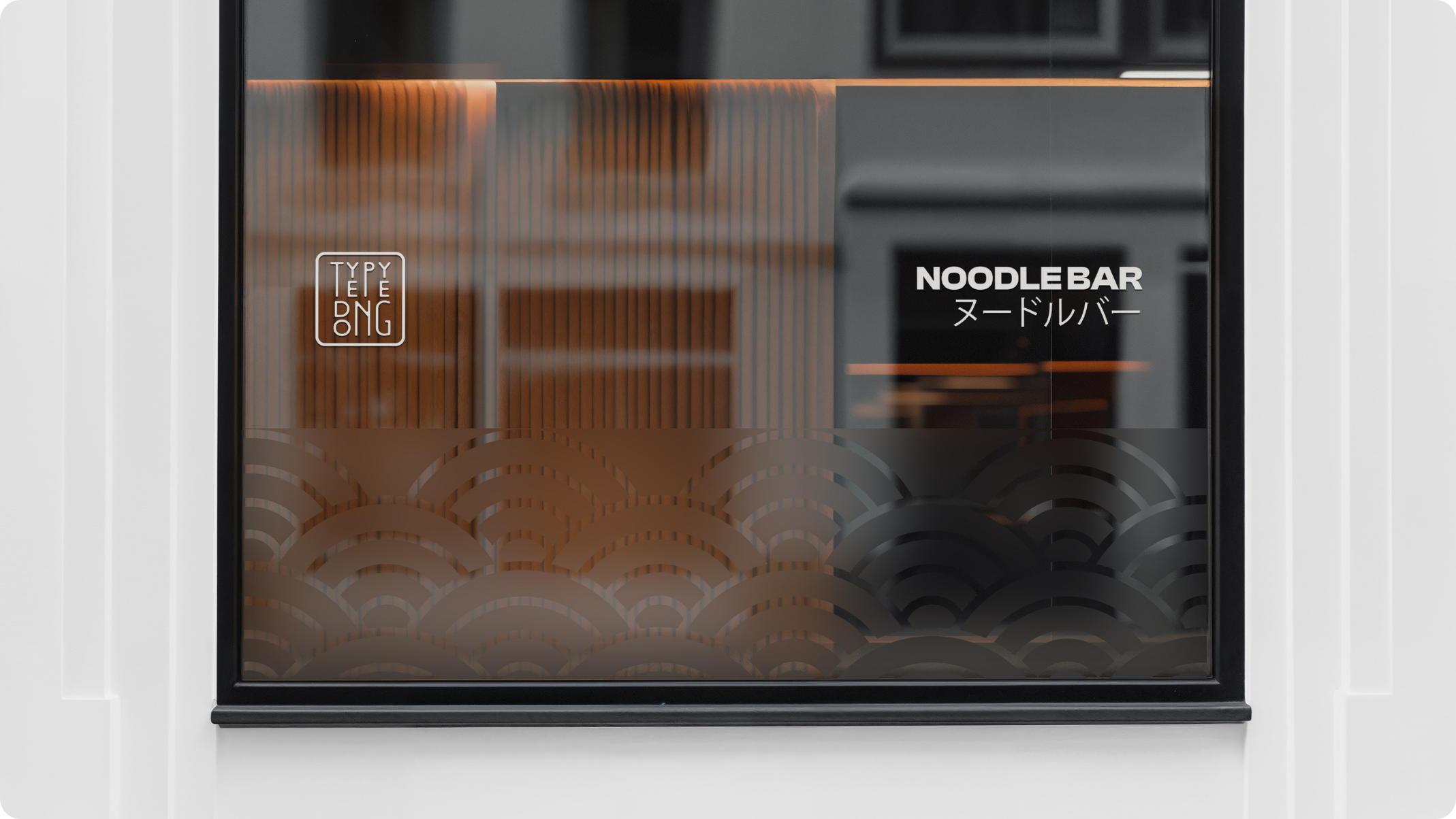
This pro bono rebranding project for a local noodle bar was created to completely transform the restaurant’s brand identity and improve its visibility in a competitive local dining scene. Although the new branding was never implemented, the project was designed to elevate the restaurant’s perception, attract new customers, and communicate its commitment to quality and hospitality.
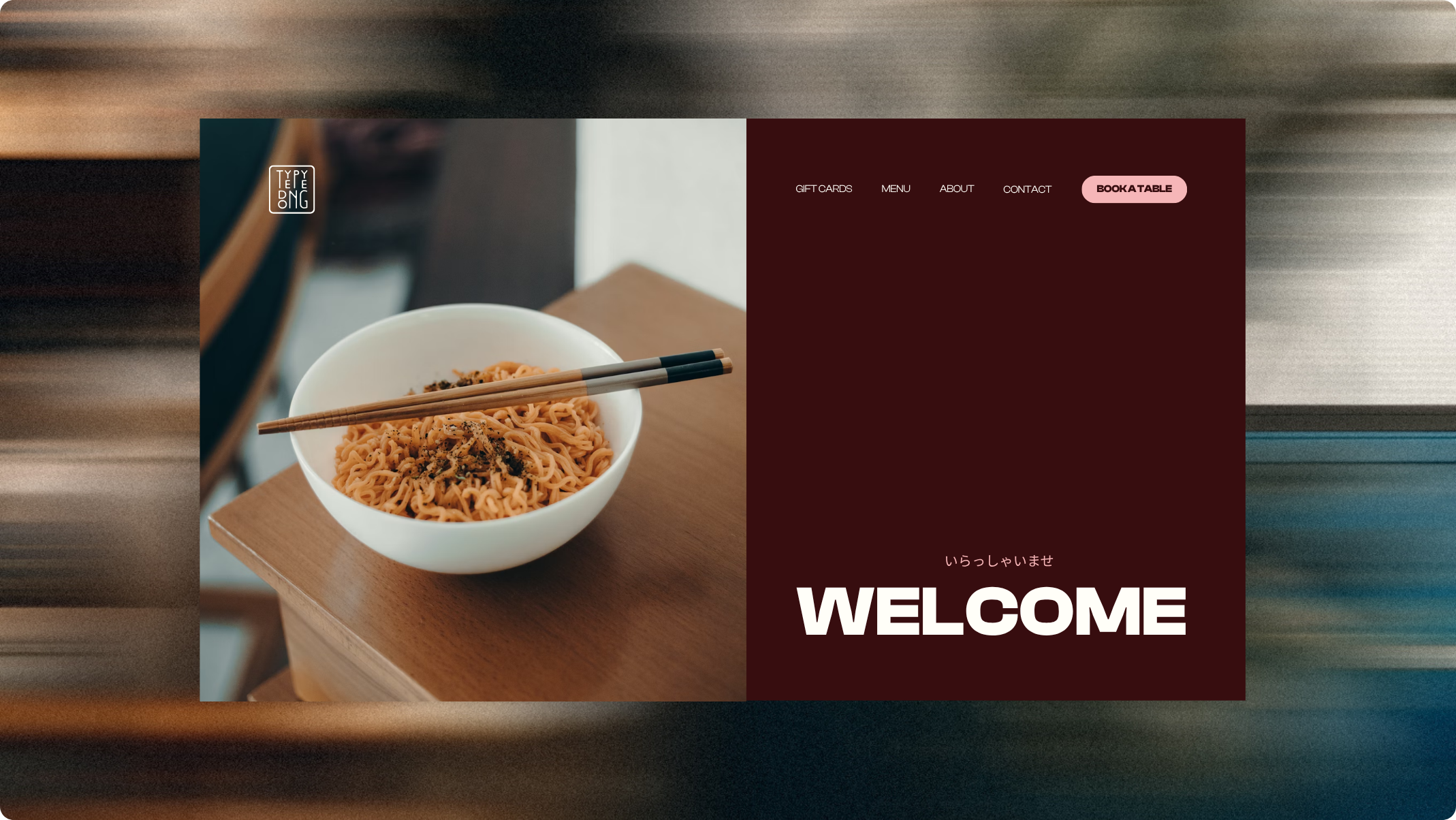
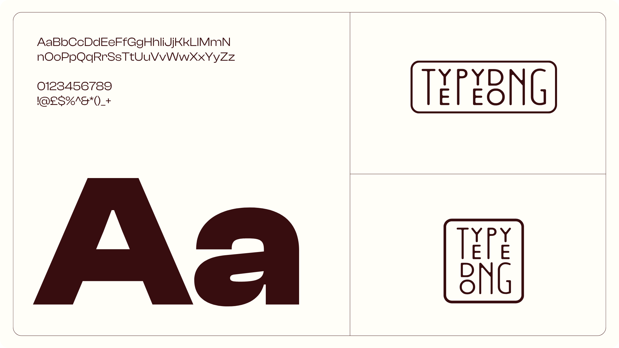
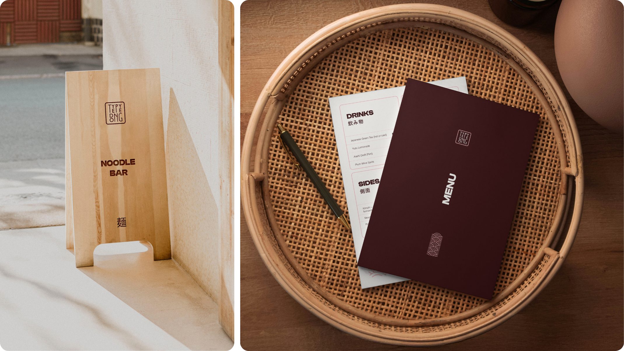
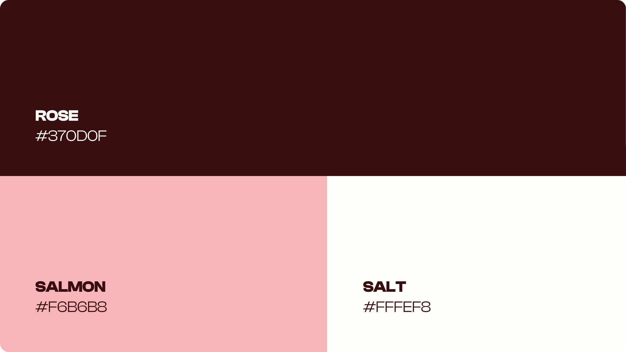
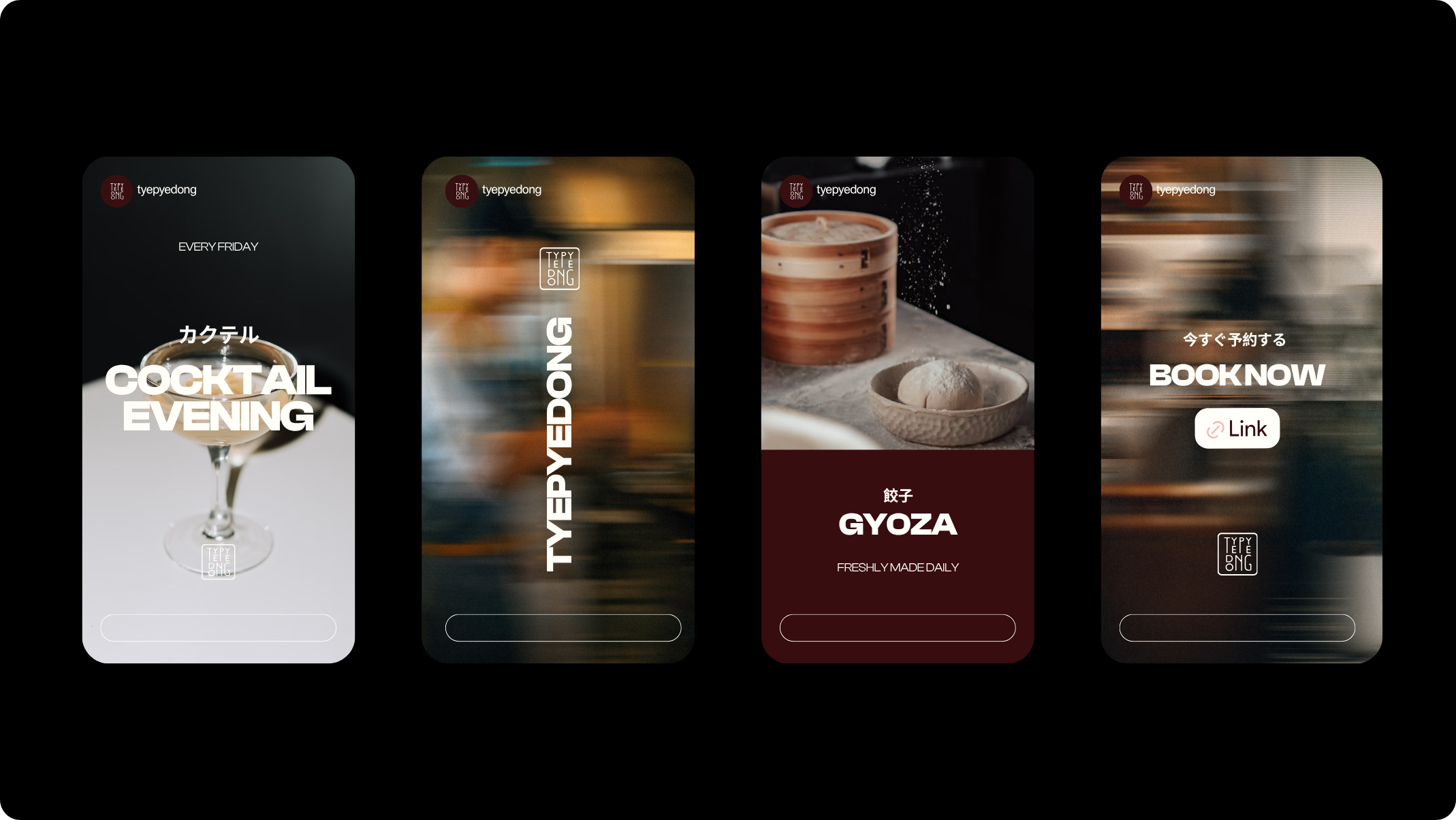
The new visual identity featured a modern logo, a cohesive colour palette, vibrant signage, redesigned menus, and a refreshed website layout. Each element was crafted to create warmth, approachability, and sophistication, positioning the noodle bar as a standout local destination.
The Challenge
Creating a Distinct Identity in a Competitive Market.
The noodle bar needed a refreshed identity that would distinguish it from neighbouring competitors and better represent the quality of its food and service. The previous brand lacked cohesion and did not reflect the restaurant’s personality or high standards.
CLIENT GOAL:
To build a strong, authentic brand that expressed warmth, community, and quality while improving visibility, encouraging loyalty, and enhancing the customer experience.
The Approach
A Modern Brand Rooted in Warmth and Simplicity.
DISCOVERY:
We began with research into the local market, audience behaviours, and competitor positioning. Through workshops, we defined a brand direction that captured the restaurant’s welcoming atmosphere and culinary craftsmanship.
DESIGN EXPLORATION:
Our creative team explored multiple directions for the new identity, focusing on a warm, vibrant, and contemporary aesthetic. The proposed logo and colour palette were designed to reflect approachability and modern simplicity, while maintaining a premium feel.
REFINEMENT:
The rebrand concept extended across multiple touchpoints to ensure consistency and impact:
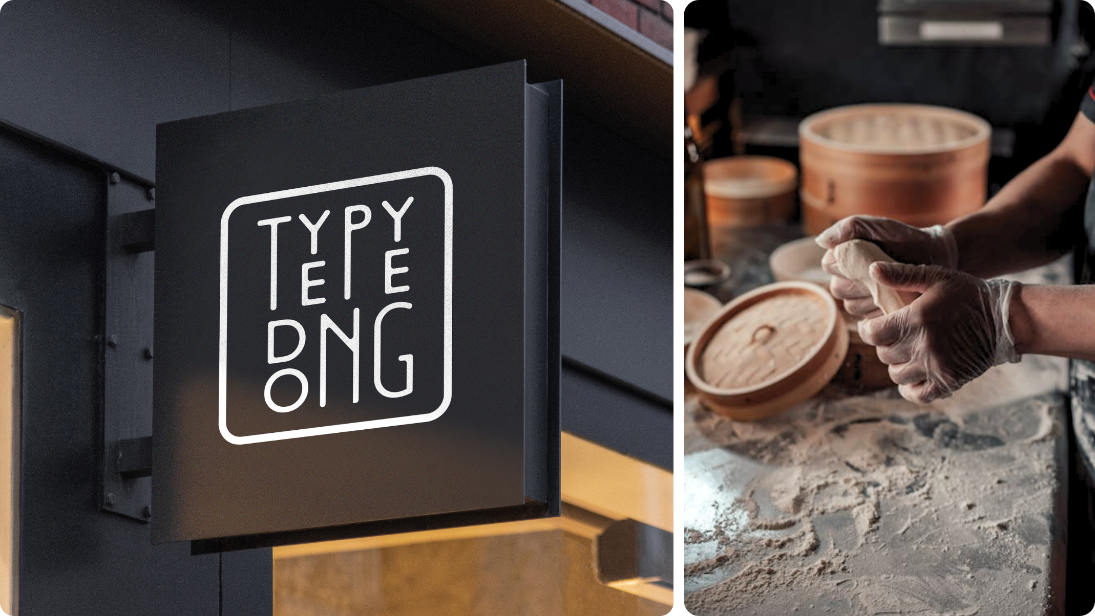
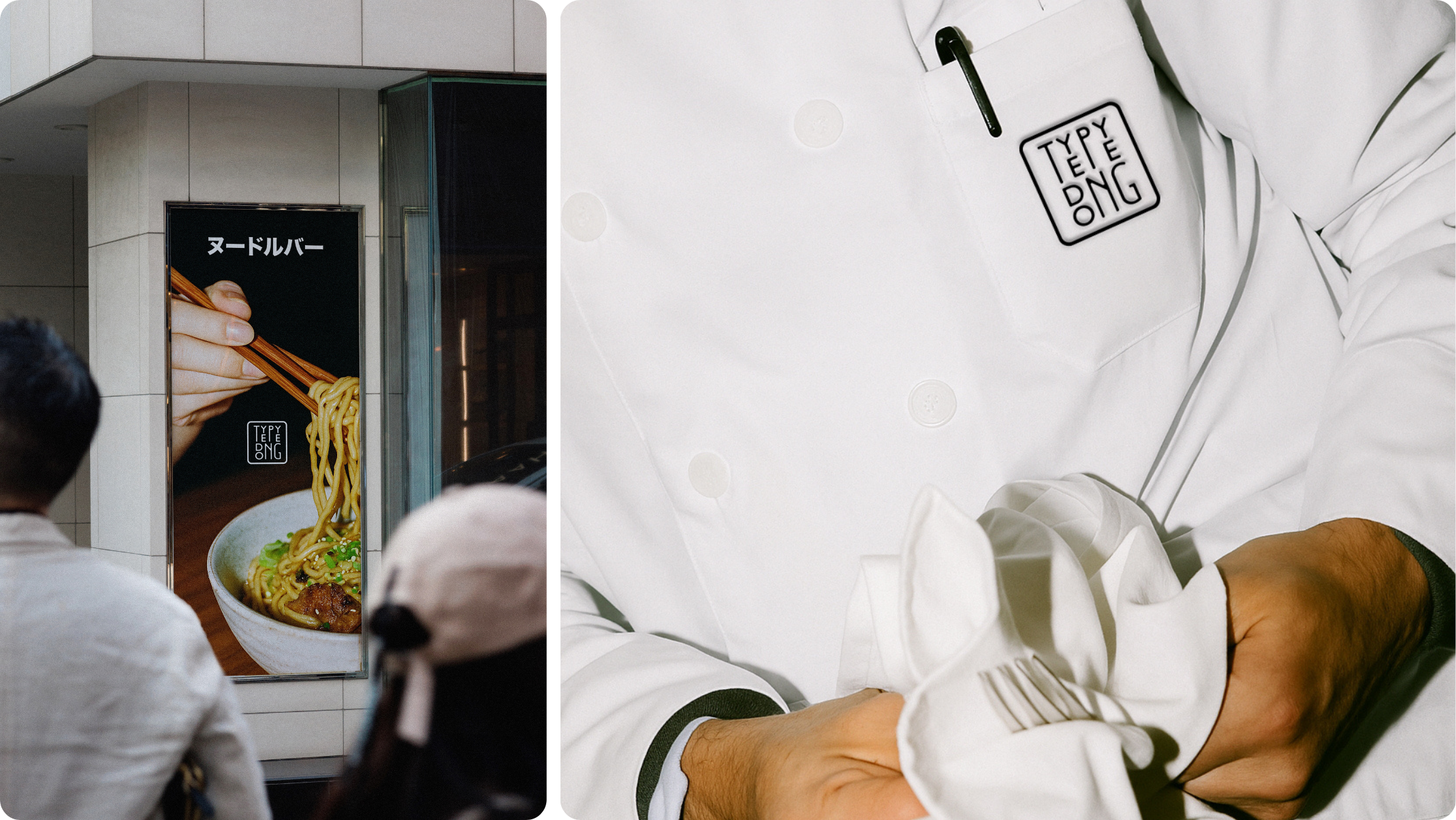
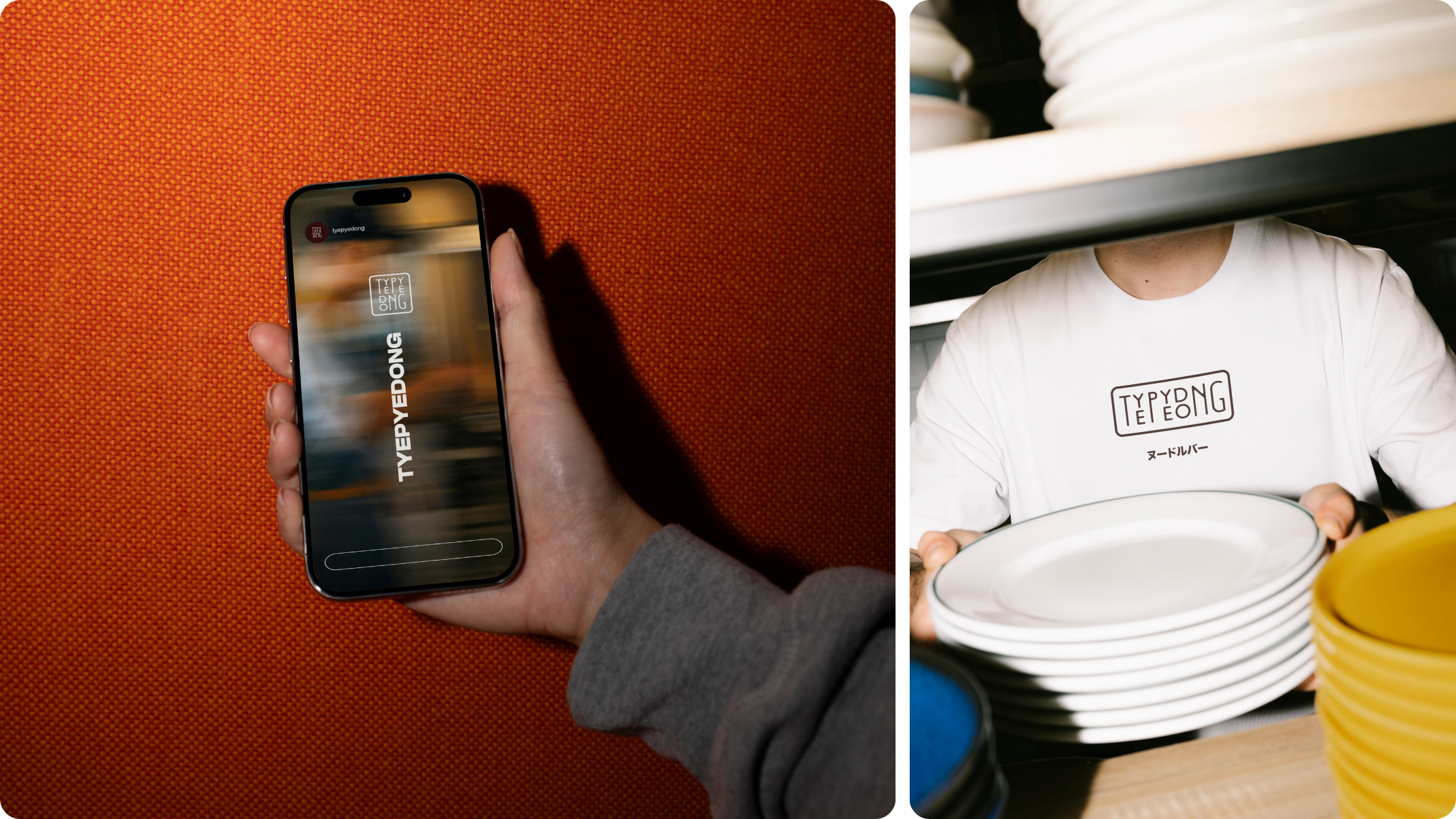
Logo Design: A friendly, modern wordmark reflecting energy and approachability.
Signage: Bright and engaging designs intended to enhance visibility and attract passing foot traffic.
Menus: Redesigned layouts with bold visuals and clear structure to improve readability and dining experience.
Stationery: Professionally branded materials to elevate credibility and cohesion.
The Outcome
A Brand Concept Designed to Elevate a Local Favourite.
Although the final brand was not implemented, the rebrand was designed to reposition the noodle bar as a warm, welcoming, and high-quality dining destination. The complete visual identity system would have created a unified brand experience across signage, menus, and digital platforms, helping to attract new customers and build long-term loyalty.
INTENDED RESULTS:
The project was designed to strengthen local awareness, increase foot traffic, and improve customer engagement — transforming the noodle bar into a recognisable and trusted name within the local restaurant community.
Industry Insight
Why Cohesive Branding Matters in Hospitality.
In the competitive restaurant and hospitality sector, cohesive and professional branding directly influences customer perception. A consistent identity across signage, menus, and online platforms helps build trust, communicates quality, and enhances the overall dining experience. The noodle bar project demonstrates the impact that design-led branding can have, even when not implemented, by showing how visual identity can transform how customers connect with a brand.