Project Review
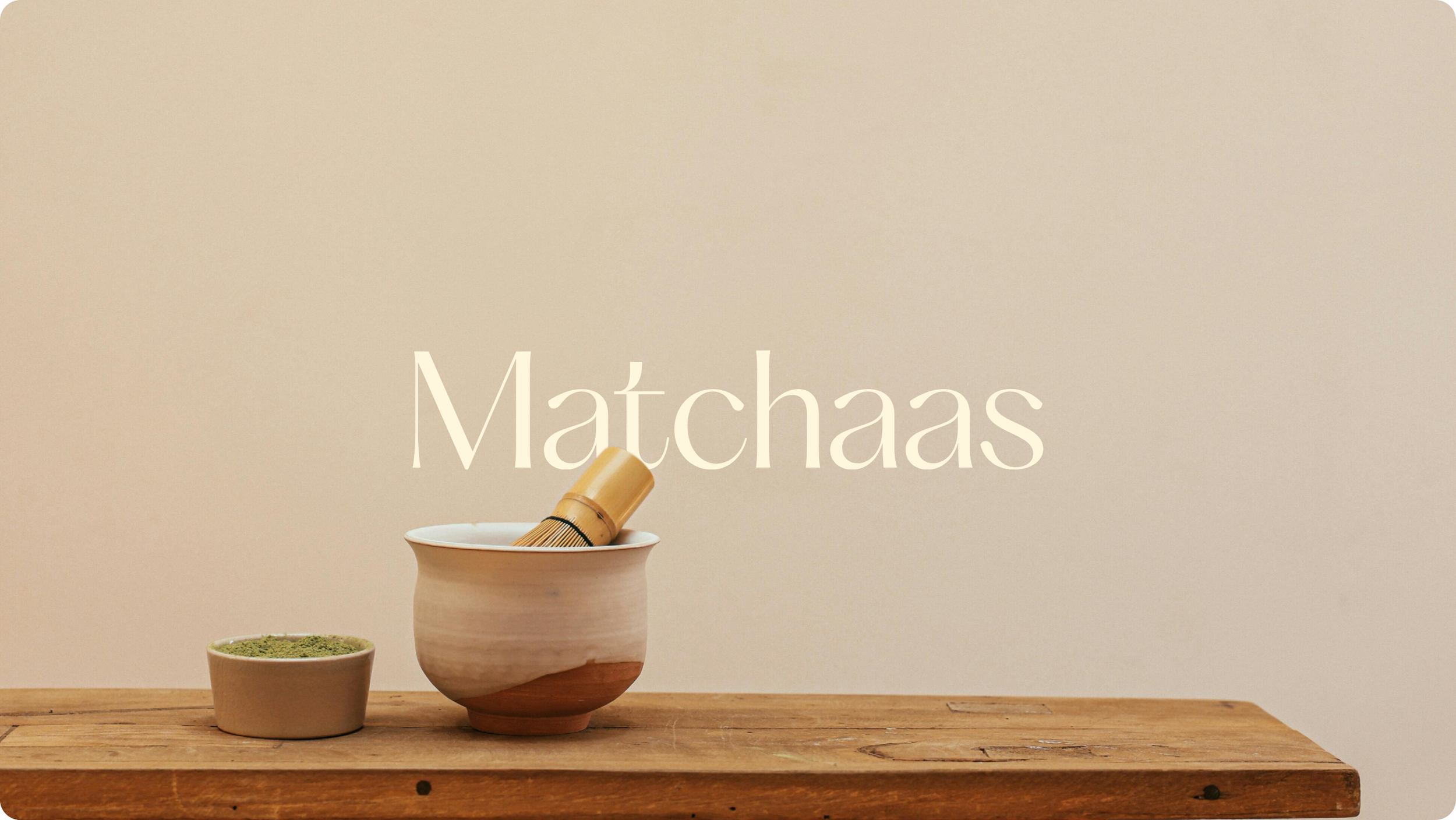
Matchaas
Client: Matchaas
Industry: Food & Beverage / Specialty Drinks
Scope: Branding, Logo Design, Packaging, Art Direction
Deliverables: Logo, Fonts, Colour Palette, Packaging, Art Direction
Timeline: 2–3 weeks
OVERVIEW:
Matchaas is a premium e-commerce matcha brand offering ceremonial-grade matcha to the Norwegian drinks market. As a startup, the brand required a premium identity that resonated with Scandinavian audiences while also conveying authentic Japanese personality.
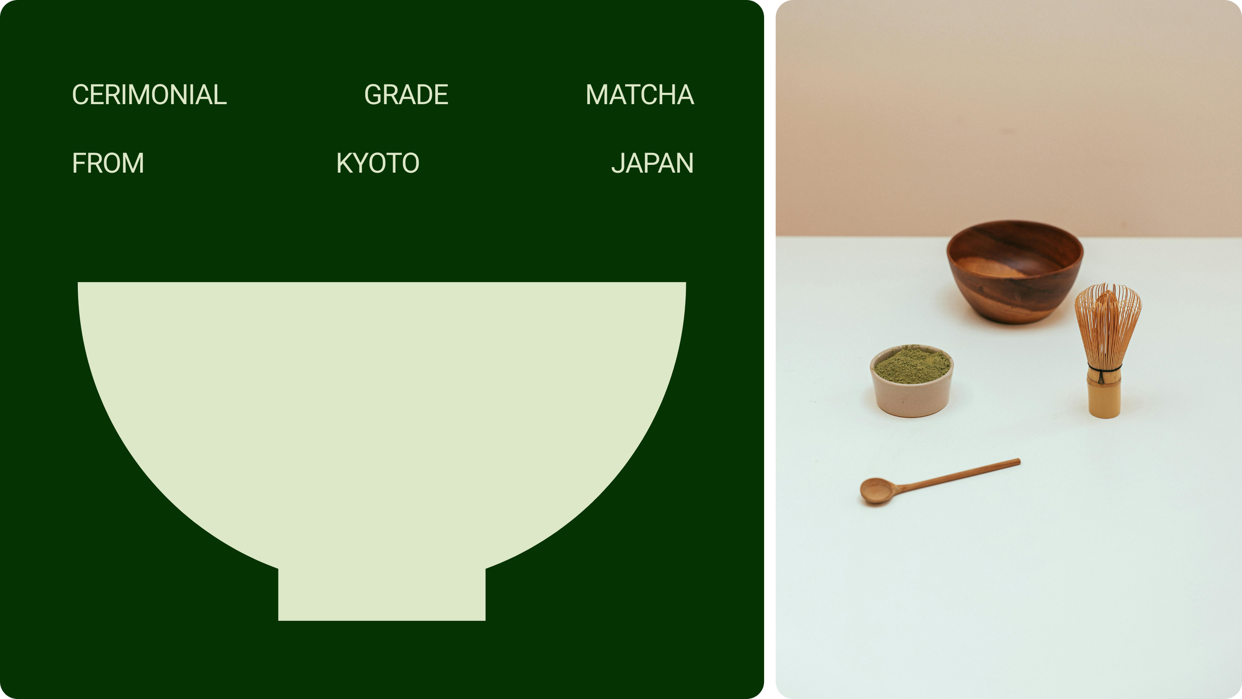
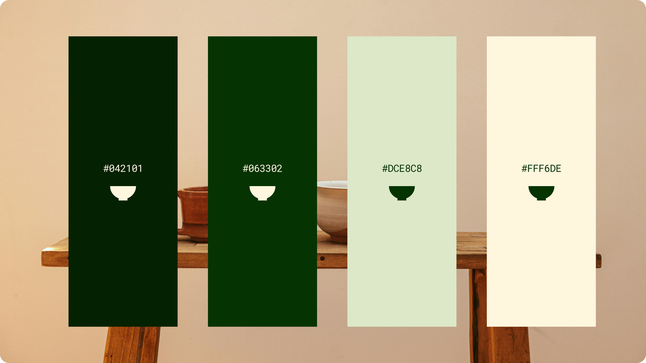
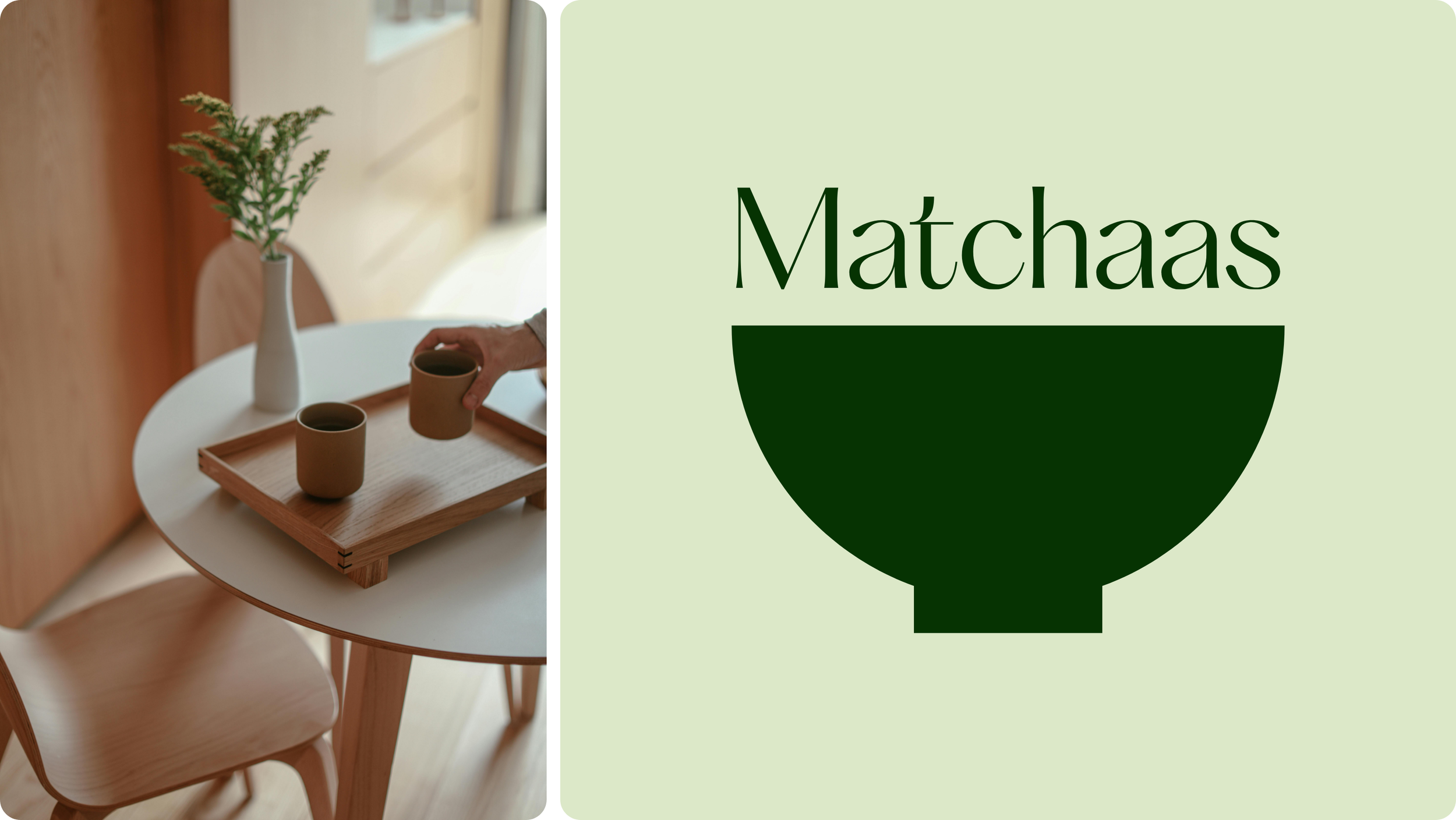
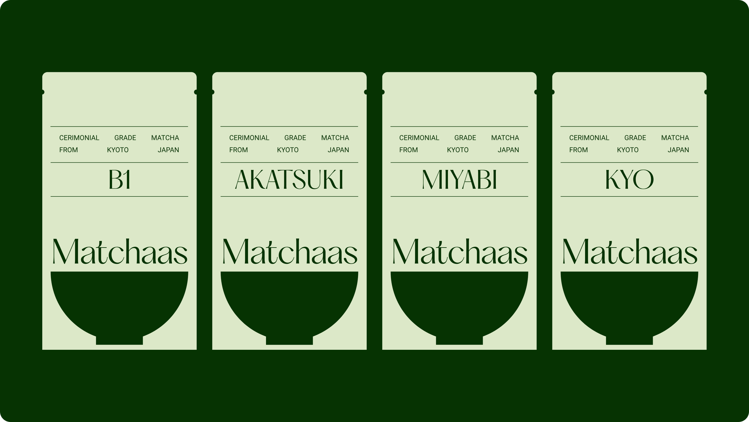
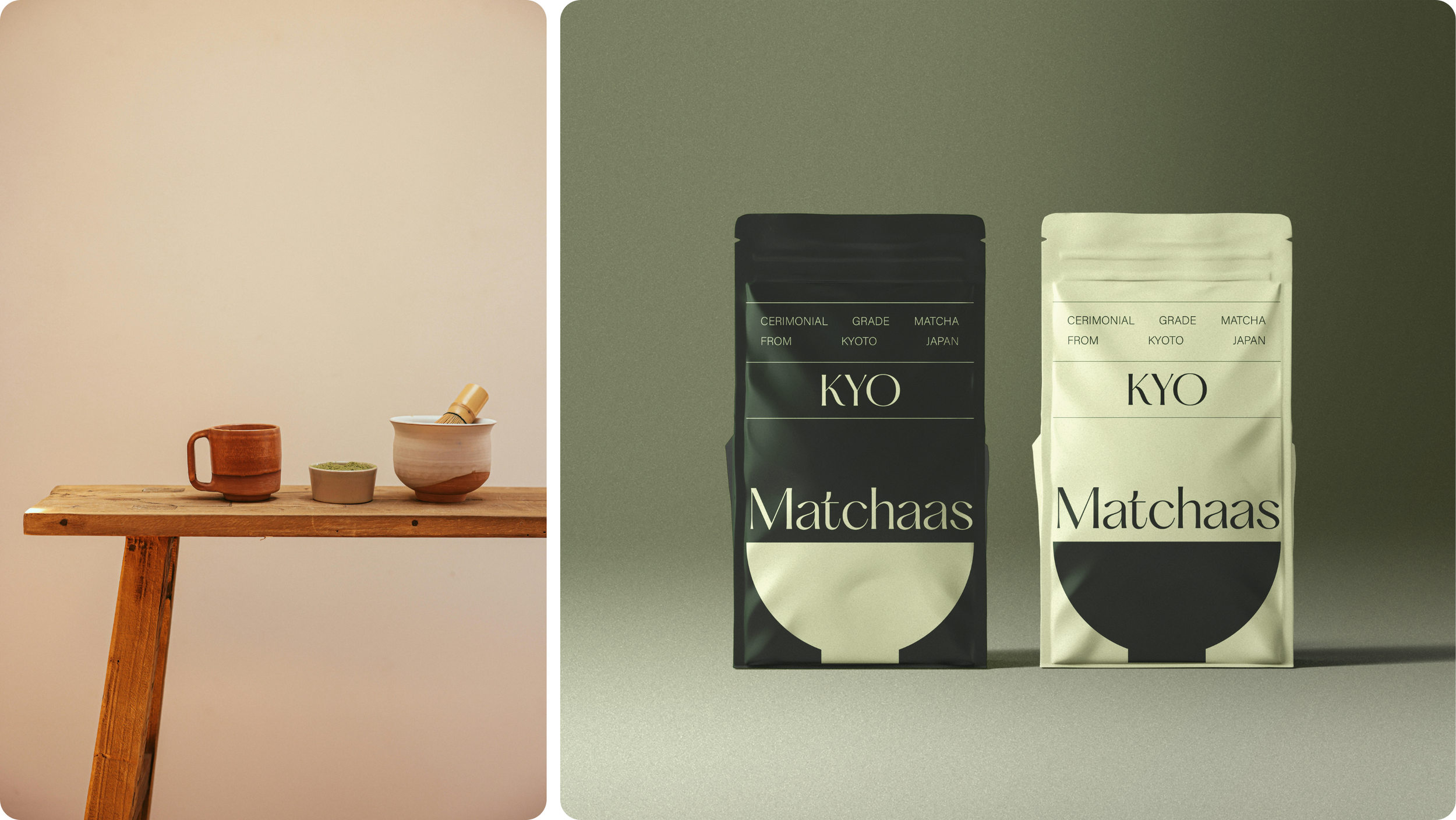
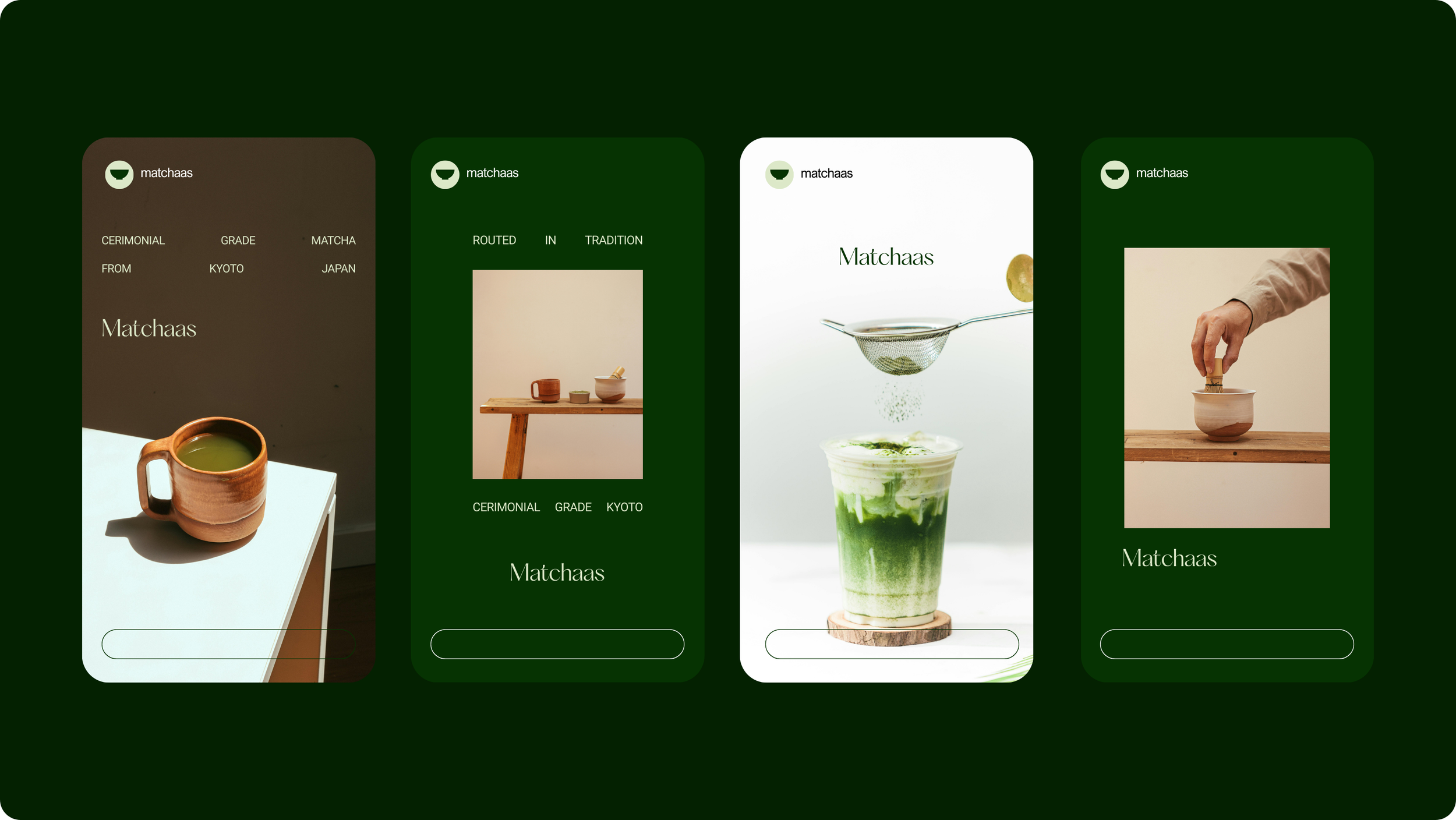
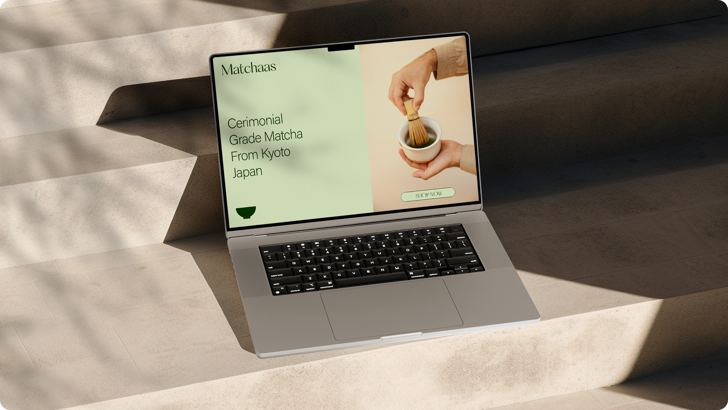
The brand direction took inspiration from Japandi style, combining warm, soft neutral tones with the vibrant greens of matcha. The logo features a simplistic wordmark in a friendly yet stylish serif font, paired with a sharp, minimalistic bowl symbol nodding to traditional Japanese matcha-making rituals.
Art direction across packaging and brand assets reflected the Japandi influence, creating a refined, high-end, and approachable visual identity. The brand successfully resonates with Scandinavian consumers while establishing Matchaas as a premium, market-leading product.
The Challenge
Creating a Premium Brand for a Niche Market.
As a new entrant in the competitive Scandinavian drinks market, Matchaas needed a brand identity that clearly communicated quality, authenticity, and sophistication. The challenge was balancing Japanese heritage and culture with a style that appealed to Scandinavian aesthetics, ensuring the product felt both premium and approachable.
CLIENT GOAL:
To design a cohesive brand identity that positions Matchaas as a high-end matcha brand, differentiates it in the Norwegian market, and appeals to consumers seeking ceremonial-grade matcha.
The Approach
Japandi-Inspired Premium Branding.
DISCOVERY:
We explored the Scandinavian market, consumer preferences, and Japanese tea traditions to define a brand approach that combined authenticity, minimalism, and premium quality.
DESIGN EXPLORATION:
The design team developed a logo and packaging concepts that reflected Japandi principles: minimalism, warmth, and harmony. We experimented with serif typography and simple yet symbolic graphics to communicate quality and cultural heritage.
BRAND CREATION:
The final brand identity included:
Logo Design: A stylish, friendly serif wordmark paired with a minimalistic bowl graphic referencing Japanese matcha rituals.
Colour Palette & Typography: Warm, neutral tones contrasted with green accents representing matcha, complemented by elegant, approachable fonts.
Packaging Design: Premium packaging that conveys quality, authenticity, and Japandi-inspired aesthetics.
Art Direction: Cohesive visual guidance to ensure consistent brand application across all touchpoints.
The Outcome
A Premium Brand that Resonates.
The Matchaas brand successfully communicates premium quality, Japanese authenticity, and Scandinavian elegance. The visual identity strengthens the product’s market positioning and conveys the brand’s personality across all consumer touchpoints.
RESULTS:
The brand resonates strongly with the Scandinavian audience and positions Matchaas as a high-end, market-leading matcha product.
Industry Insight
Why Thoughtful Branding Matters in Specialty Drinks.
For niche premium food and beverage products, brand identity is a critical differentiator. Thoughtful design, cultural references, and cohesive visual language help establish trust, create desire, and communicate quality. Matchaas demonstrates how combining cultural authenticity with local design preferences can build a premium, aspirational brand.