Project Review
Norrk.
Client: Norrk Developments
Industry: Commercial Builder & Property Developer
Scope: Branding & Logo Design
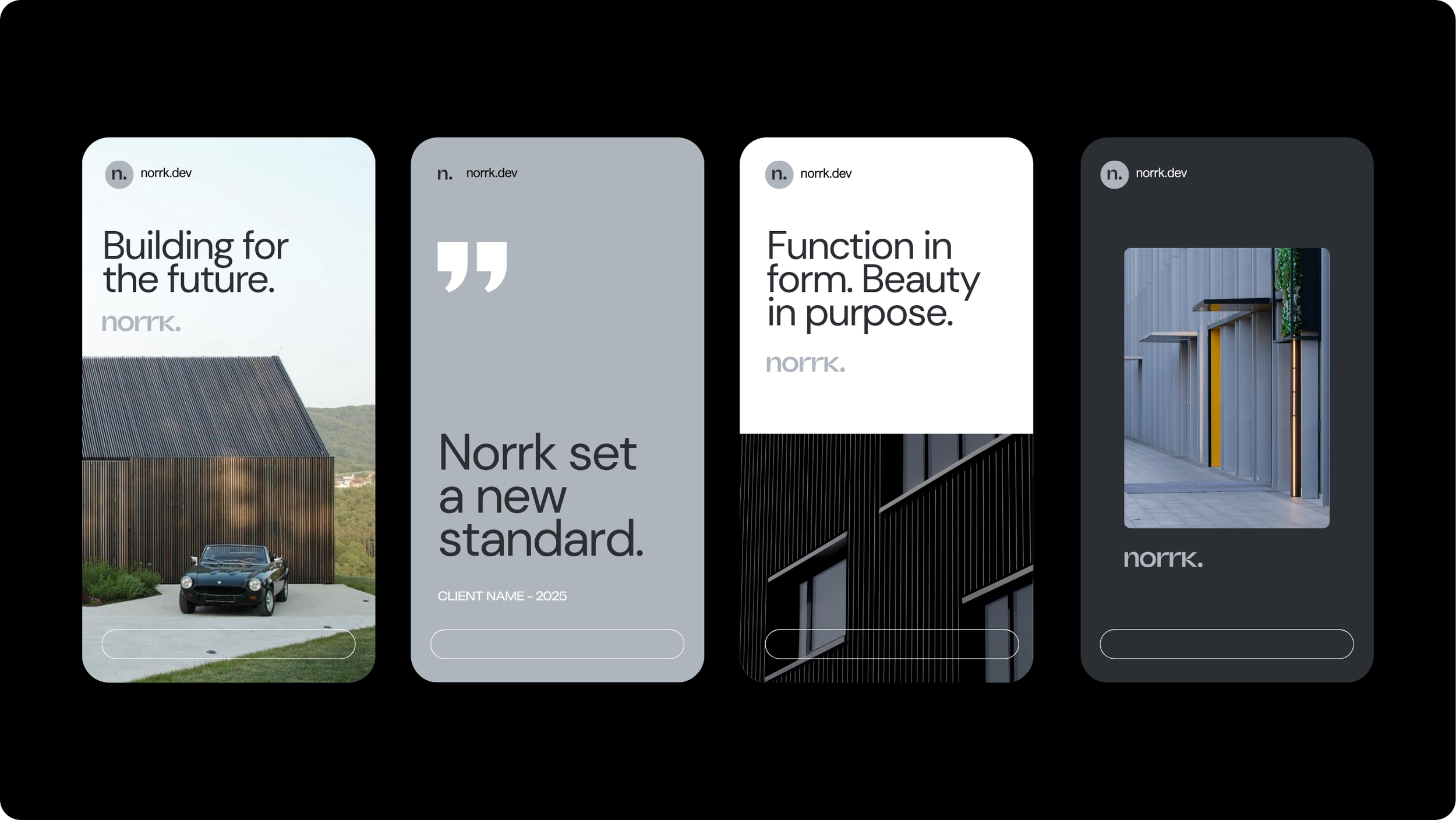
Deliverables: Logo, Colour Palette, Fonts, Business Cards, Invoice Template, Front Cover Template, Social Media Templates
Timeline: 3 weeks
OVERVIEW:
Norrk Developments approached us to create a bold new brand identity for their growing construction and development business. Based on the Gold Coast and operating across Brisbane, they wanted a brand that reflected their reputation for precision, innovation, and high-quality builds.
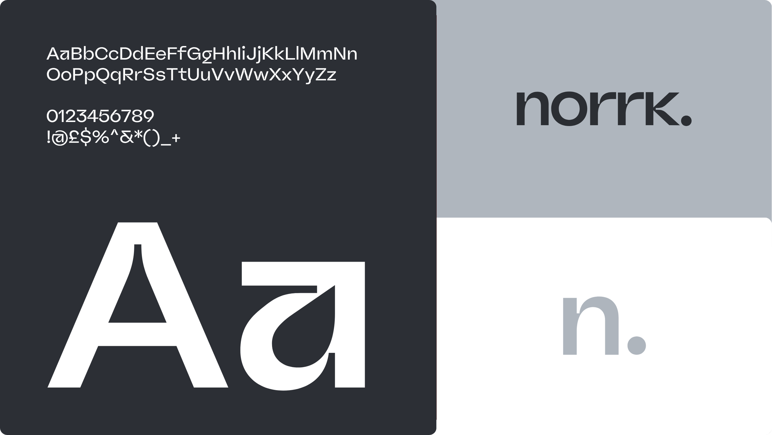
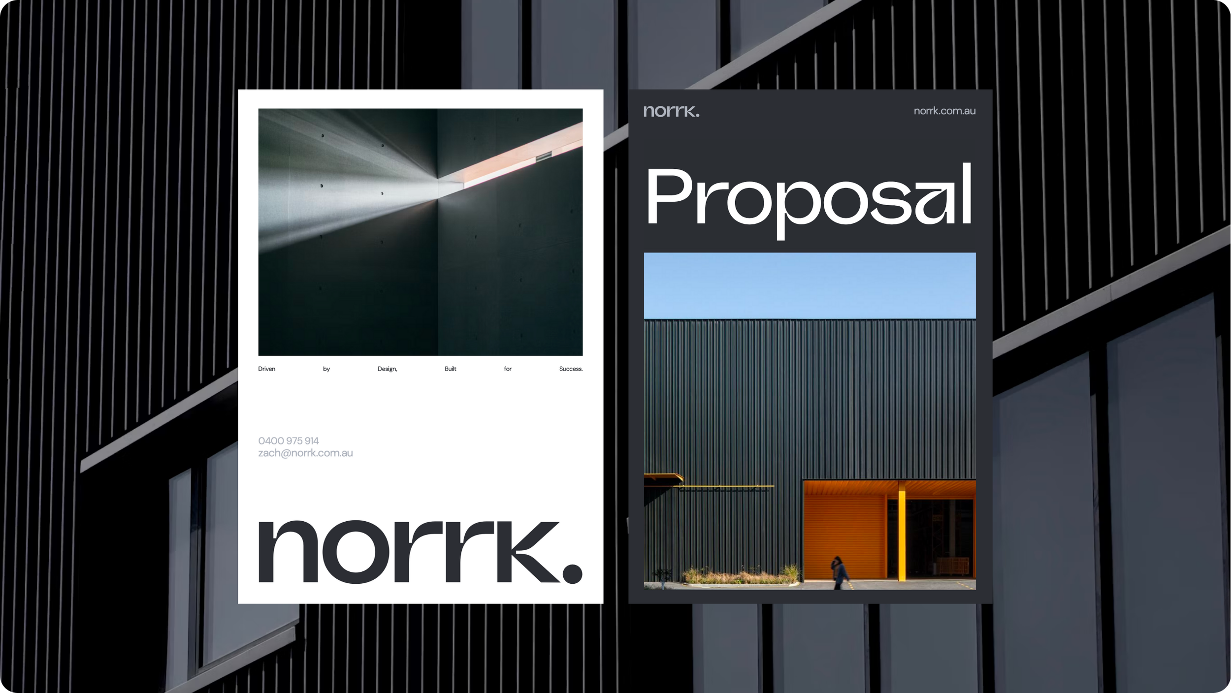
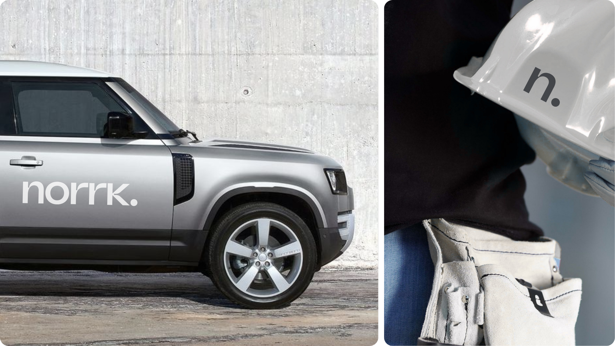
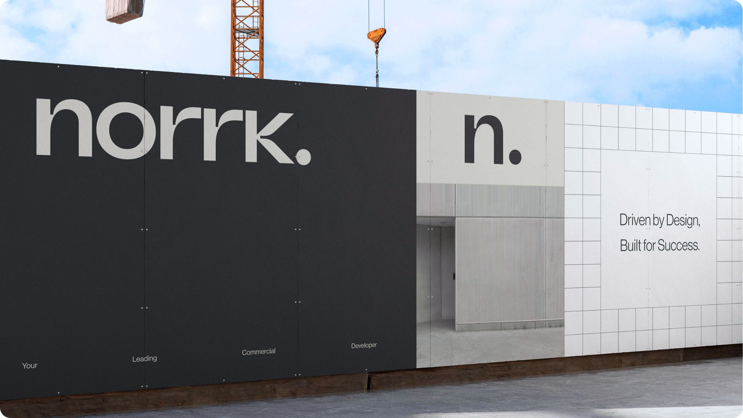
We developed a minimalistic wordmark logo using a custom sans-serif typeface to reflect their modern approach and forward-thinking methods. The result is a clean, confident, and professional identity that embodies trust, transparency, and quality construction.
The Challenge
Rebranding a Commercial Builder for a Modern Market.
The commercial building and development industry is often dominated by outdated or generic branding, with limited focus on design or innovation. Norrk wanted to stand out as a builder that combines style and functionality, a concept rarely seen in the commercial sector.
Their challenge was to build a brand that showcased their expertise in modern construction techniques while also communicating their values of honesty, professionalism, and design excellence. They needed an identity that felt as progressive as the projects they delivered.
The Approach
Building a Brand That Reflects Strength and Style.
DISCOVERY:
We began by understanding Norrk’s core purpose to bring architectural precision and style to commercial spaces. Through brand workshops and competitor analysis, we identified opportunities to position Norrk as a forward-thinking construction brand rooted in craftsmanship and innovation.
DESIGN EXPLORATION:
Our design team explored a range of typographic directions before developing a refined wordmark logo inspired by architectural lines and structure. The inkwell-inspired sans-serif typeface added a futuristic, tech-driven edge that captures Norrk’s progressive mindset.
REFINEMENT:
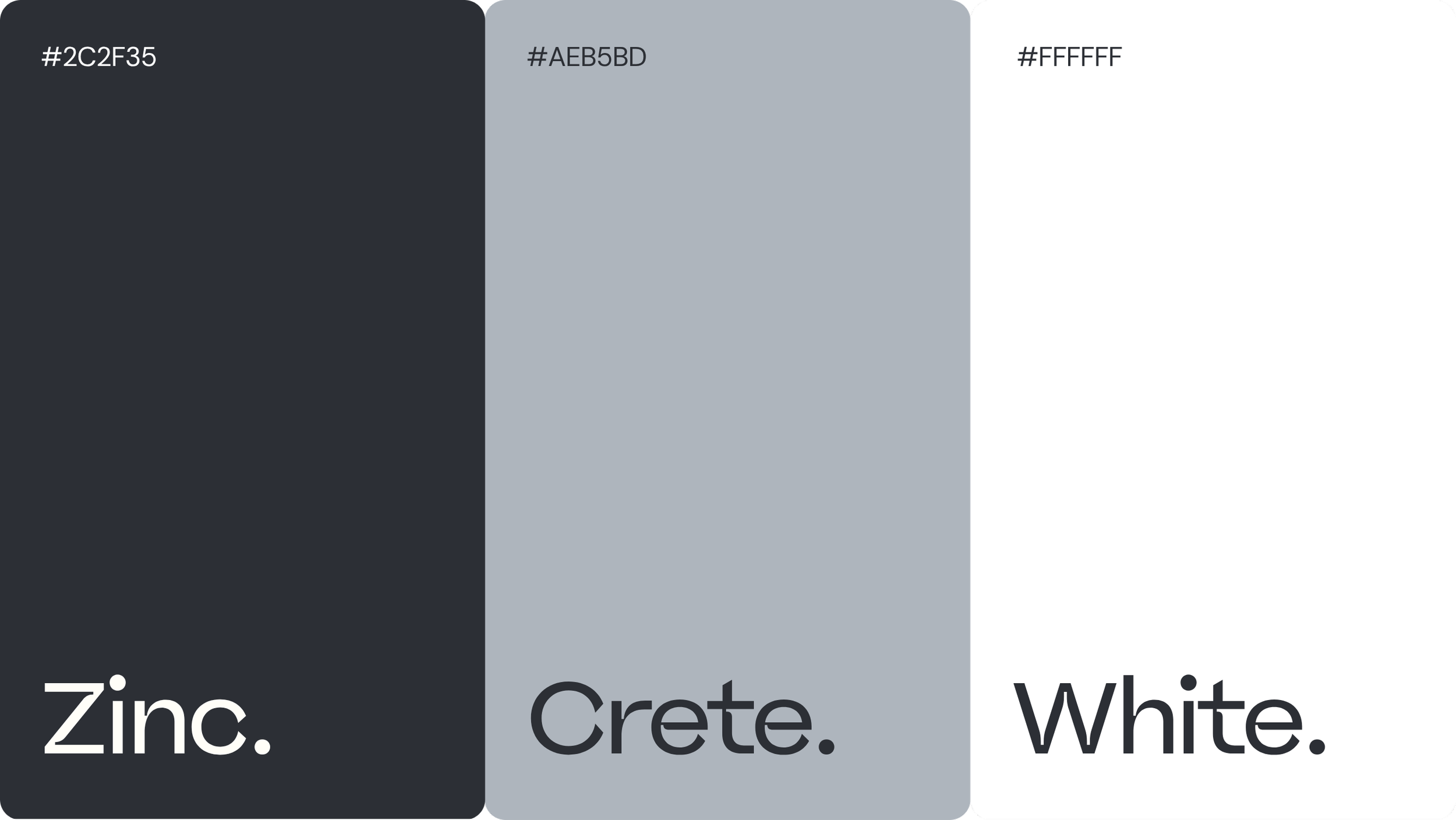
We chose a monochromatic colour palette to mirror the materials found on site such as concrete, steel, and glass, symbolising strength and reliability. Every element was stripped back to its essentials, creating a timeless, minimalist aesthetic that reflects the brand’s professional character.
The Outcome
A Confident Brand Identity for a Modern Construction Leader.
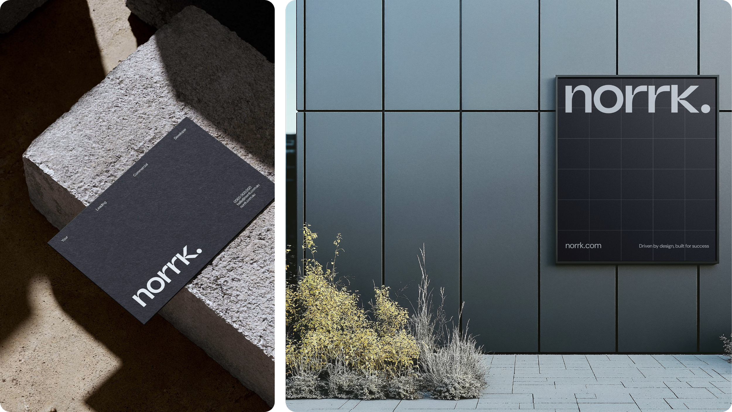
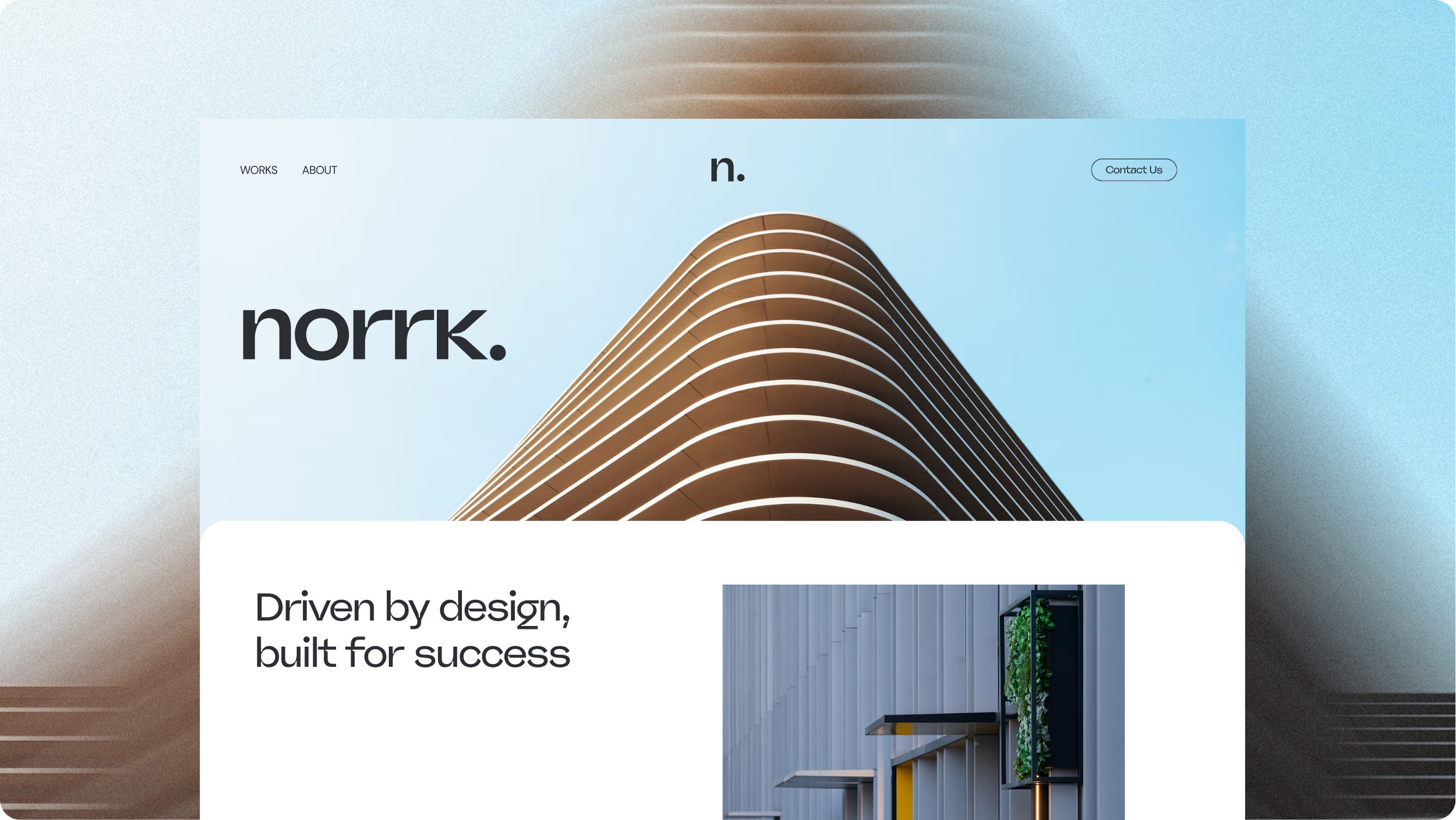
The final brand identity is bold, minimalist, and scalable. The geometric wordmark logo communicates confidence and precision, while the monochrome palette reinforces Norrk’s no-nonsense, design-led approach.
From stationery to social media templates, every touchpoint now presents Norrk as a trusted, future-focused developer. The new brand positions them as a standout name in the competitive Gold Coast and Brisbane construction market.
Industry Insight
Why Design-Led Branding Matters in Construction.
In today’s construction and development industries, a professional brand identity is key to building trust and attracting clients. Norrk’s minimalist branding demonstrates that modern builders can balance craftsmanship with creativity, standing out through clarity, precision, and design integrity.